项目用 Tuist 把应用拆成独立模块,用 mise 管理工具链版本。每个功能都在 Modules/ 下拥有自己的模块:
Modules/
Data/<- SwiftData models (Habit, HabitInstance)
DayView/<- the main day scaffold and navigation
Timeline/<- the scrollable time grid
HabitTray/<- the expandable bottom sheet
Interaction/<- shared drag coordinator and helpers
Create `Modules/HabitTray` (do not expand `DayView`). The reasoning mirrors the Phase 3 decision to split Timeline:
1.**Responsibility**: The tray owns substantial independent state — expanded/collapsed toggle, `@Query` over all `Habit` objects, sort order by frequency, add-habit form presentation. Placing this in `DayView` would make that file responsible for layout orchestration, timeline paging, date navigation, and habit management all at once.
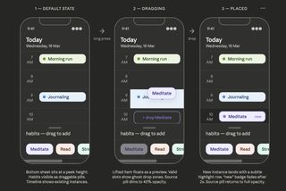
2.**Phase 5 drag coordination**: When drag & drop arrives, `DayView` will thread a `hoveredSlot: Binding<Int?>` between `HabitTrayView` and `DayTimelineView`. This binding already exists on `DayTimelineView` (defaulting to `.constant(nil)`). The boundary is clean: `DayView` owns the shared drag state; `HabitTray` and `Timeline` are consumers. This is the same pattern already planned in Phase 3.
3.**Mac reuse (Phase 9)**: The menu bar popover uses the same `DayView` root. If the tray is a separate module, Phase 9 can tune `HabitTrayView` for the compact 320pt popover width without touching `DayView` or `Timeline`.
4.**Testability**: Frequency-sort logic and hex-to-Color parsing can be unit-tested in `HabitTrayTests` in isolation.
**Dependency chain after Phase 4:**
```
ProjectDawn (app) → DayView → HabitTray → Data
→ Timeline → Data
```
---
## Naming Notes
- The module is `HabitTray`; the public entry point view is `HabitTrayView`. No collision risk with SwiftUI system types.
- The add-habit form is `HabitFormView` (internal to `HabitTray`). Phase 7 may promote it if edit needs to be triggered from elsewhere.
-`HabitPillView` is a shared internal component used by both the collapsed and expanded states.
- The color helper is `Color+Hex.swift` — a `Color` extension, internal to the module.
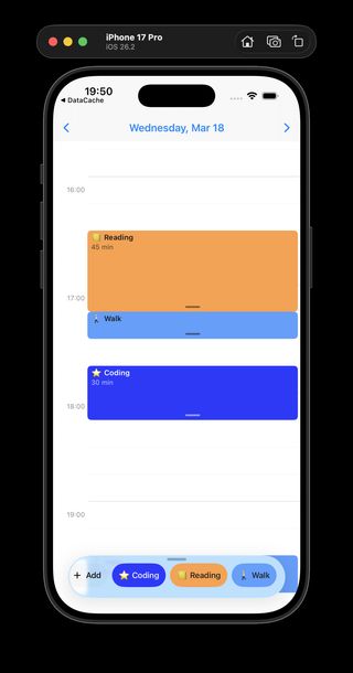
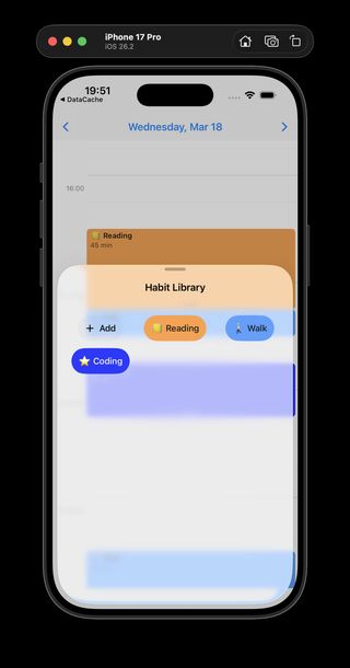
> **Implementation note:** `HabitLibrarySheet` was removed during implementation. The collapsed strip and expanded grid were unified into a single always-on sheet in `HabitTrayView` using `presentationDetents(selection:)`. `DayView` presents it via `.sheet(isPresented: .constant(true))`. `presentationBackgroundInteraction(.enabled(upThrough: collapsedDetent))` allows timeline interaction while the tray is collapsed.
- Create the required empty directories: `Modules/HabitTray/Sources/`, `Modules/HabitTray/Resources/`, `Modules/HabitTray/Tests/` (Tuist globs these; they must exist).
---
### Step 2 — Wire into workspace and `DayView`
**Commit:**`chore(tuist): wire HabitTray into workspace and DayView`
-`Workspace.swift` — add `"Modules/HabitTray"` to the `projects` array.
-`Modules/DayView/Project.swift` — add `.project(target: "HabitTray", path: "../HabitTray")` to the `dependencies` array alongside the existing `Timeline` entry.
- Run `tuist generate` to verify the graph resolves cleanly.
---
### Step 3 — `Color+Hex.swift` (internal helper)
**Commit:** (bundled with Step 6)
Every `Habit` stores its color as a hex string (`colorHex: String`). The tray needs `hex → Color` for rendering and `Color → hex` when saving a custom-picked color.
```swift
// Modules/HabitTray/Sources/Color+Hex.swift
import SwiftUI
extension Color {
/// Parses a 6-digit hex string (with or without leading `#`) into a Color.
/// Returns `.accentColor` as a safe fallback for malformed input.
init(hex: String) {
let hex = hex.trimmingCharacters(in: CharacterSet.alphanumerics.inverted)
The luminance threshold of `0.55` correctly renders dark text on Sun (`#FECA57`) and Stone (`#B2BEC3`), and white text on Coral, Mint, Sky, Lavender, and Rose. It also handles arbitrary `ColorPicker` output.
.onChange(of: customColor) { _, _ in useCustomColor = true }
}
.padding(.vertical, 4)
}
}
}
```
The `ColorPicker` is clipped to a circle so it matches the preset swatch row visually. Tapping it opens the system full-spectrum picker. `onChange` automatically switches `useCustomColor = true`.
ForEach([15, 30, 45, 60, 90, 120], id: \.self) { mins in
Text("\(mins) min").tag(mins)
}
}
.pickerStyle(.wheel)
.frame(height: 120)
}
}
.navigationTitle("New Habit")
.navigationBarTitleDisplayMode(.inline)
.toolbar {
ToolbarItem(placement: .cancellationAction) {
Button("Cancel") { isPresented = false }
}
ToolbarItem(placement: .confirmationAction) {
Button("Save") { save() }
.disabled(isSaveDisabled)
}
}
}
}
private func save() {
let resolvedHex = useCustomColor
? (customColor.toHex() ?? selectedColorHex)
: selectedColorHex
let habit = Habit(
name: name.trimmingCharacters(in: .whitespaces),
emoji: emoji,
colorHex: resolvedHex,
defaultDuration: defaultDuration
)
context.insert(habit)
isPresented = false
}
}
```
**Emoji field note**: `TextField` allows multi-character input. The `onChange` handler trims to the first grapheme cluster. Most emoji are single scalars > U+00FF; skin-tone variants use sequences, so `prefix(2)` handles those. A dedicated emoji picker grid (Phase 7) will replace this.
---
### Step 7 — `HabitLibrarySheet.swift` (internal)
**Commit:**`feat(HabitTray): HabitLibrarySheet — expanded grid of all habits`
-`.presentationDetents([.fraction(0.7), .large])` lets the user pull the sheet fully open if they have many habits.
-`.presentationDragIndicator(.visible)` provides a system drag handle — no need to draw a custom one.
- Frequency sort (`instances.count`) is computed in-memory since `@Query` cannot sort on relationship aggregates. Hundreds of habits is the realistic scale — in-memory is negligible.
- The `onAddHabit` closure bubbles up from `HabitTrayView` so form presentation is controlled from one call site.
-**Drag gesture**: `DragGesture(minimumDistance: 10)` with a negative-Y threshold (`< -20`) triggers the sheet. The horizontal `ScrollView` consumes horizontal gesture vectors first, so the tray's drag gesture only fires on predominantly upward swipes — no conflict.
-**Two independent sheets** (`showLibrary`, `showAddHabit`): When the user taps "+ Add Habit" inside the library, `showLibrary = false` runs first, then `showAddHabit = true`. SwiftUI processes these sequentially, avoiding the "sheet presenting over sheet" runtime warning on iOS 17.
-**Separate `@Query` in tray and library**: Both query the same table. SwiftData deduplicates at the persistent store layer. Avoids prop-drilling a potentially large array.
---
### Step 9 — Wire `HabitTrayView` into `DayView`
**Commit:**`feat(DayView): replace tray placeholder with HabitTrayView`
In `Modules/DayView/Sources/DayView.swift`, replace the placeholder:
```swift
// Before:
// Phase 4: HabitTray
Color.secondary.opacity(0.1)
.frame(height: 80)
// After:
HabitTrayView()
```
Add `import HabitTray` at the top.
In `Modules/DayView/Project.swift`, add the new dependency:
The `@modelContainer` is injected at the app entry point (`ProjectDawnApp.swift`), so `HabitTrayView`'s `@Query` and `HabitFormView`'s `@Environment(\.modelContext)` resolve automatically — no changes to `ProjectDawnApp.swift`.
| `refactor(HabitTray): merge library sheet into HabitTrayView as a single always-on sheet` | `Sources/HabitTrayView.swift`, `Sources/HabitLibrarySheet.swift` (deleted), `Modules/DayView/Sources/DayView.swift` |
---
## Key Trade-offs
| Decision | Choice | Reason |
|---|---|---|
| Module split | New `HabitTray` module | Single responsibility; isolated unit tests for sort/color logic; Phase 9 Mac reuse |
| Tray sort order | `createdAt` descending | Simple default; Phase 5 replaces with usage-frequency when logging is implemented |
| Frequency sort in library | In-memory sort on `instances.count` | `@Query` cannot sort on relationship aggregates; 100s of habits is the realistic scale — in-memory is negligible |
| Emoji picker | `TextField` clamped to first grapheme | Zero dependencies, good enough for v1; Phase 7 replaces with grid picker during edit-habit work |
| Drag gesture vs handle tap for expansion | Both (drag on strip + tappable handle) | Handle tap is more discoverable; drag is more natural once users know the tray |
| `ColorPicker` integration | System `ColorPicker` as rainbow swatch | Zero custom code for full-spectrum picker; renders as a circle swatch matching the preset row |
| `toHex()` implementation | `UIColor`/`NSColor` bridge with `#if canImport` guard | Required for Mac compatibility; `Color` has no public RGB accessors in SwiftUI |
| Two `@Query` instances (tray + library) | Kept separate | Avoids prop-drilling; SwiftData deduplicates at the persistent store layer |
这份文档塑造了 Codex 的实现方式。写下来也意味着,实际结果偏离计划时,我有依据可以回看。而且它就在仓库里,未来某次 Claude 会话即使没有背景,也能读完立刻理解理由,不需要我重新说明。
但慢也是真的。有些时候,我只能等 Claude 完成一轮规划,没法继续前进。这不至于让我放弃,认真思考本就需要时间,但需要知道,这不是一种“每秒六十帧式氛围编程”的工作流。
最早需要我介入的地方之一,是并发处理。Claude 用 DispatchQueue.main.async 生成了一些定时逻辑,这是旧式 Grand Central Dispatch 模式,现代 Swift 代码大多已经转向其他方式。它能用,但放在其余地方都使用 async/await 和 Task.sleep 的代码库里,显得不协调。
The iOS UIKit rule at the heart of this: **a view controller cannot present a new modal if it already has a presented view controller.** If it tries, the existing presented VC is typically dismissed first.
### The presentation stack
```
ProjectDawnApp
└── DayView ← the presenting VC
└── .sheet(.constant(true)) → HabitTrayView ← the presented VC (tray)
└── .sheet($showAddHabit) → HabitFormView
```
### Why it breaks
`InstancePillView` lives in `DayTimelineView`, which is part of `DayView`'s content tree — underneath the tray sheet in the UIKit hierarchy. When `.contextMenu` or `.confirmationDialog` fires from `InstancePillView`, UIKit must present the resulting `UIAlertController` (or context menu overlay) **from `DayView`'s VC**.
But `DayView`'s VC is already presenting `HabitTrayView`. UIKit sees a VC trying to present something new while it already has a presented VC, and resolves the conflict by dismissing the tray — which is exactly the symptom.
The `.contextMenu` modifier makes it worse: on iOS, long-pressing content beneath a sheet can cause UIKit to actively dismiss the covering sheet in order to surface the context menu's "peek" of the underlying content. That explains why the tray vanishes *before* the confirmation even appears.
The bug report's conclusion is correct: **the delete confirmation is being launched from the wrong presentation layer.** The confirmation needs to originate from inside the tray sheet (the topmost presented VC), not from the timeline content underneath it.
---
## What Is NOT the Issue
- Not a SwiftData problem — the delete itself would work fine if the UI could present correctly.
- Not specific to `confirmationDialog` vs `alert` — any modal presentation from the timeline subtree hits the same wall, which is why the alternate `alert` approach also failed.
- Not a race condition or timing issue.
---
## Fix Options
### Option 1 — Inline SwiftUI confirmation within the pill
Replace the `.confirmationDialog` with a small "confirm delete?" overlay rendered directly inside `InstancePillView` using `ZStack`/`.overlay`. No UIKit presentation machinery is triggered, so the tray is never disturbed. This is the least invasive fix.
**Tradeoff:** Non-standard UX pattern — users expect a system-level confirmation for destructive actions. Requires custom styling to communicate clearly.
### Option 2 — Present confirmation from inside `HabitTrayView`
`HabitTrayView` sits at the top of the presentation stack, so it can safely present. Communicate the "instance to delete" from `InstancePillView` up to `HabitTrayView` via a shared environment value or coordinator, then let `HabitTrayView` own and present the confirmation dialog.
**Tradeoff:** More wiring — `InstancePillView` needs a way to signal delete intent upward through the view tree without owning the presentation itself.
### Option 3 — Bubble delete intent to `DayView`, present from the tray sheet
Store a `pendingDeleteInstance: HabitInstance?` in a shared coordinator (e.g., `HabitDragCoordinator` or a new `TimelineActionCoordinator`). `InstancePillView` sets it; `HabitTrayView` observes it and presents the confirmation from inside the sheet.
This is structurally similar to Option 2 but uses the existing coordinator pattern from Phase 5 rather than a new binding chain.
**Tradeoff:** Adds responsibility to the coordinator that is conceptually unrelated to drag & drop.
---
## Recommended Fix
**Option 1 (inline confirmation)** is the path of least resistance for Phase 6. The delete action is low-frequency and the pill already has an expanded state (`isExpanded`) — a secondary "confirm?" state within the pill is consistent with that existing pattern and avoids touching the presentation hierarchy at all.
If a system-level confirmation is strongly preferred, **Option 2** is cleaner than Option 3 because it keeps delete logic close to where instances are displayed.