The Blog Themes I Would Never Have Built, and the Freedom to Be Picky
Part of a series
- AI-Assisted Engineering Series (20 of 20)
- Product Engineering (4 of 4)
My blog felt a bit plain. A bit light. I wanted to see what else it could look like.
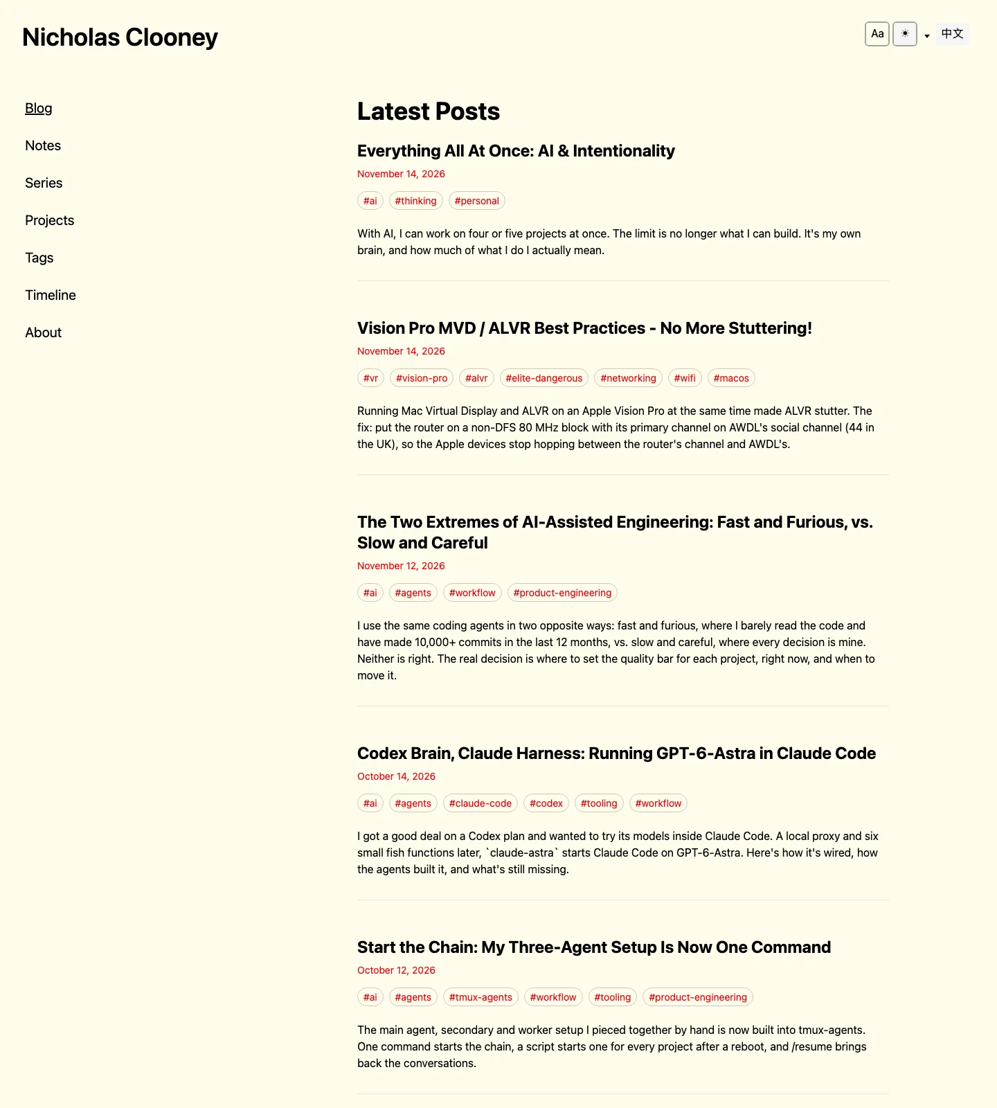
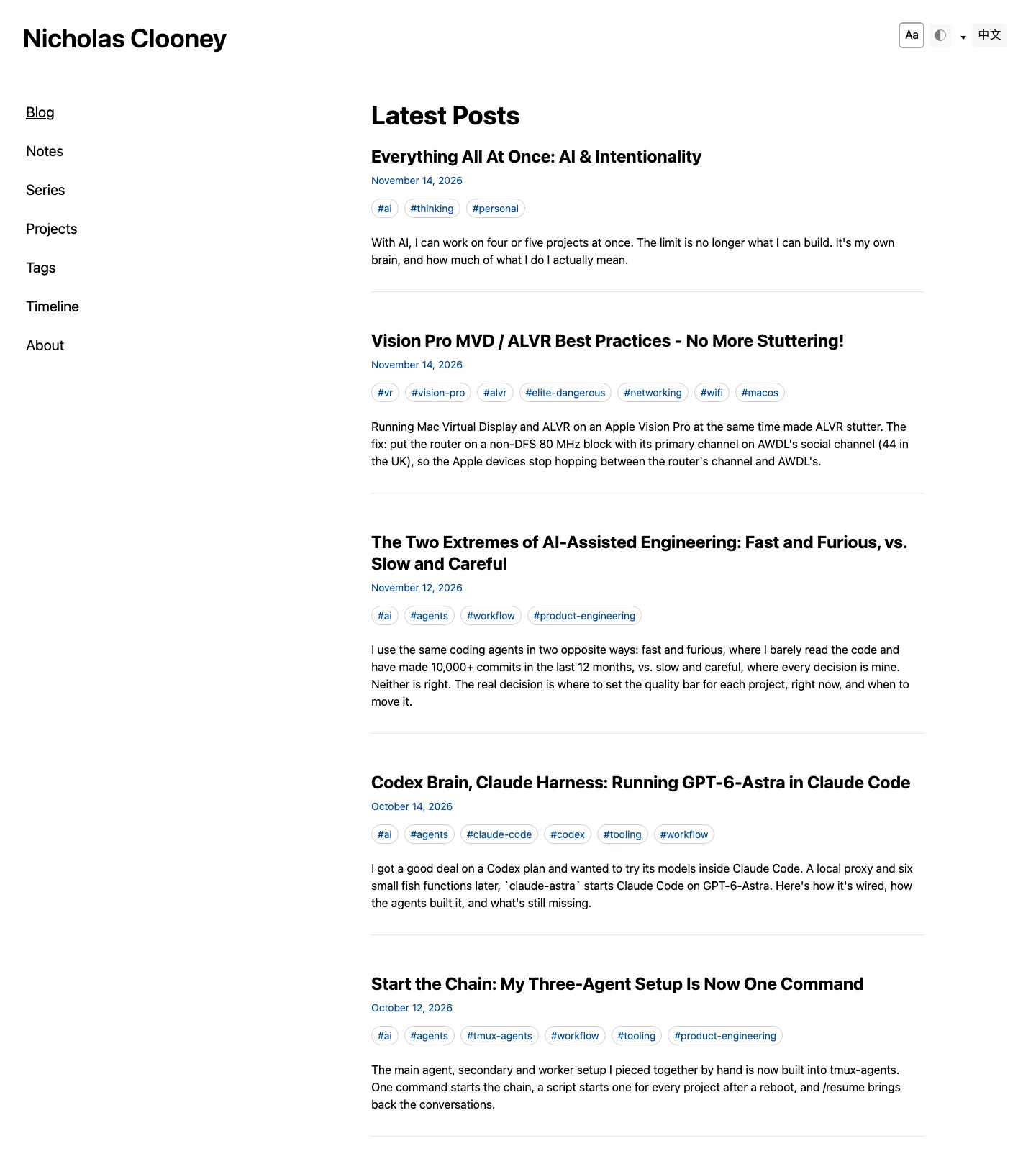
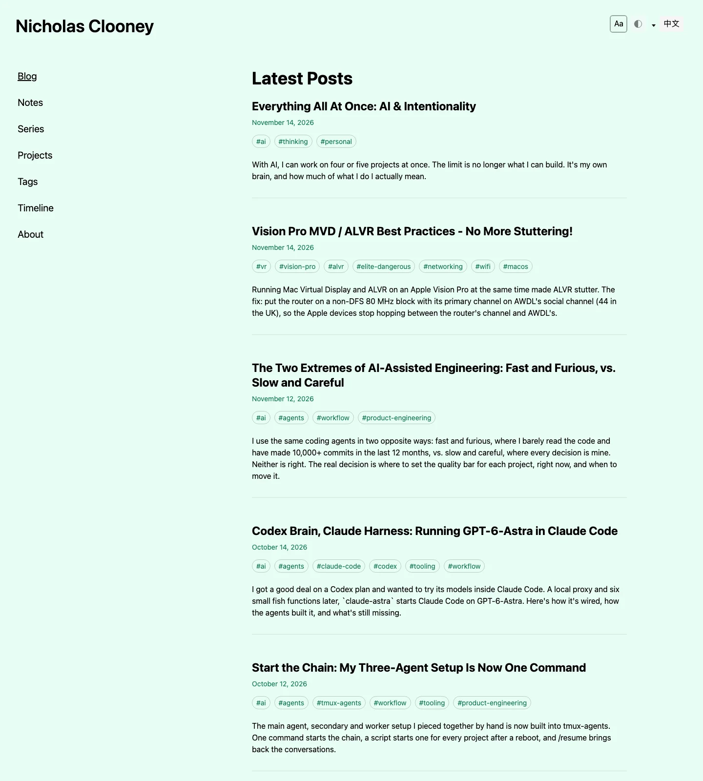
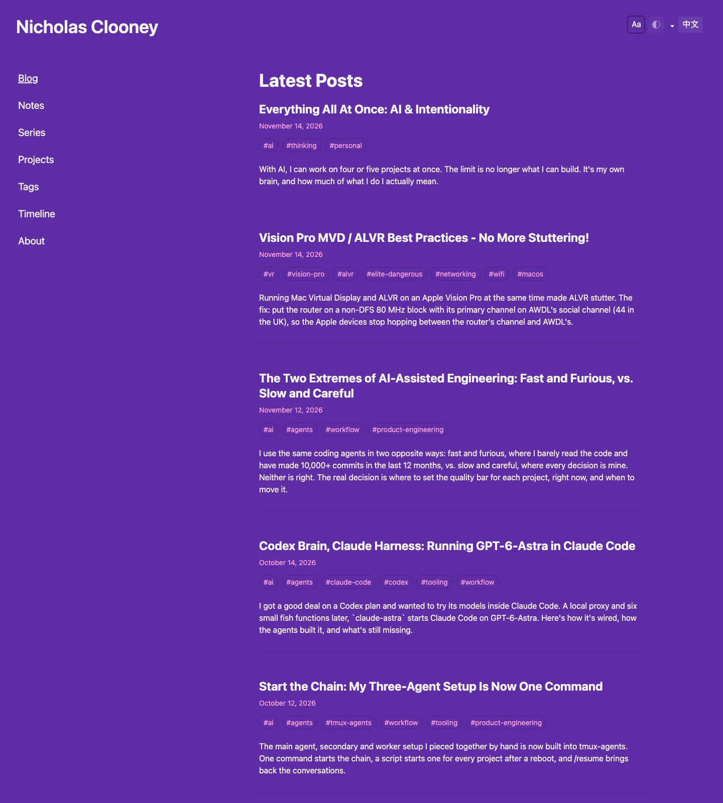
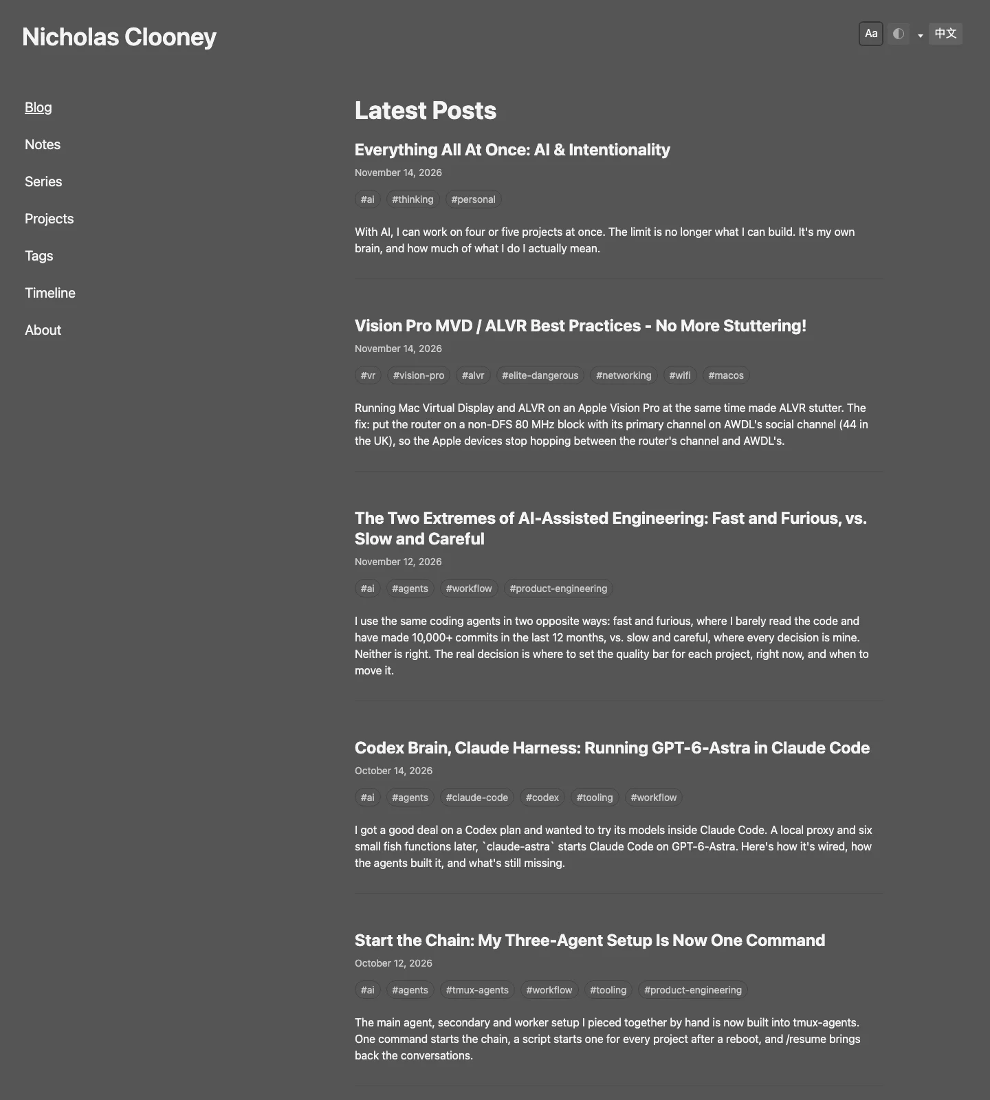
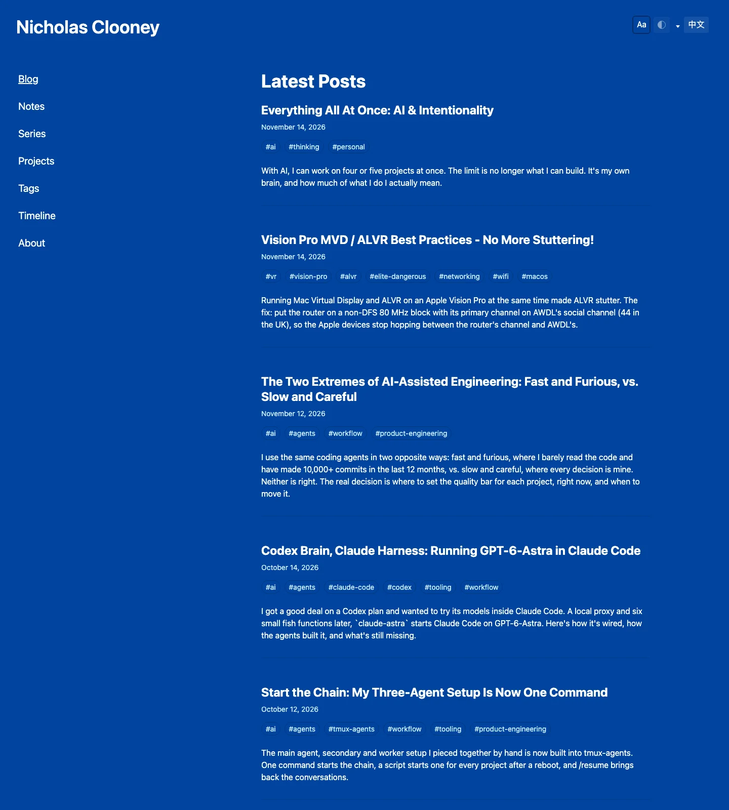
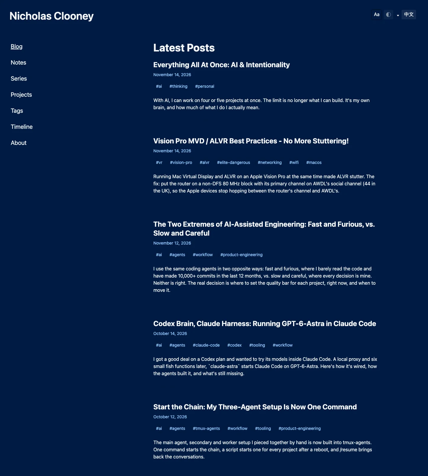
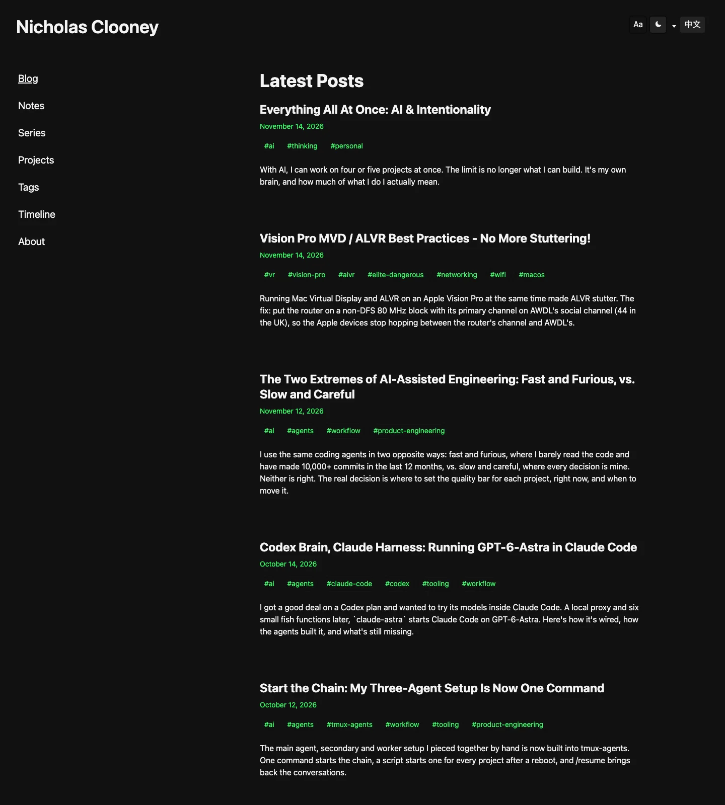
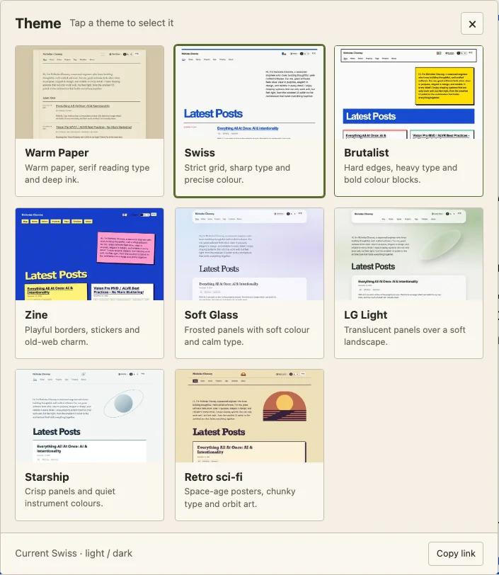
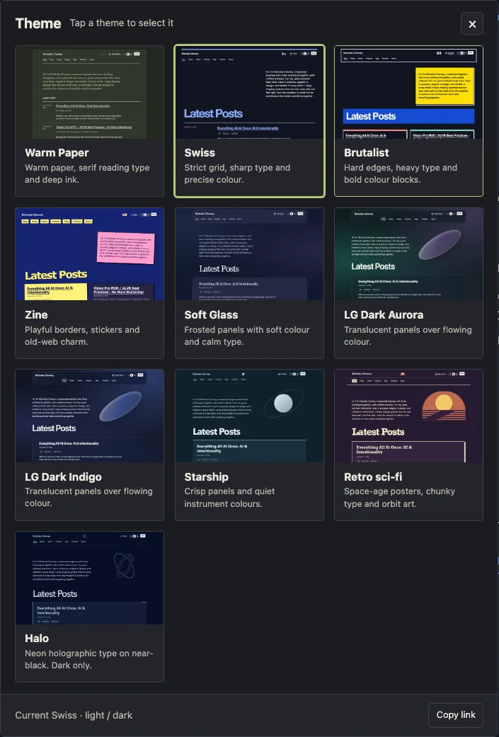
The previous themes, in their existing order. Same layout, different colours. Tap a screenshot to see it full size; on a phone, swipe across the row.
That turned into eleven theme options, a design lab skill, and a theme switcher that went through more discussion than I expected. It took about a day of on-and-off work, while I was also working on three to five other projects.
I can't imagine designing all of these myself, let alone implementing them. Definitely not in a day. More likely, I would have looked at the time involved, picked something close enough, and gone back to the other things I wanted to build.
This time I could actually explore.
How many themes do you need anyway?
Turns out, for me, it's 11 themes with light and dark modes. Roughly.
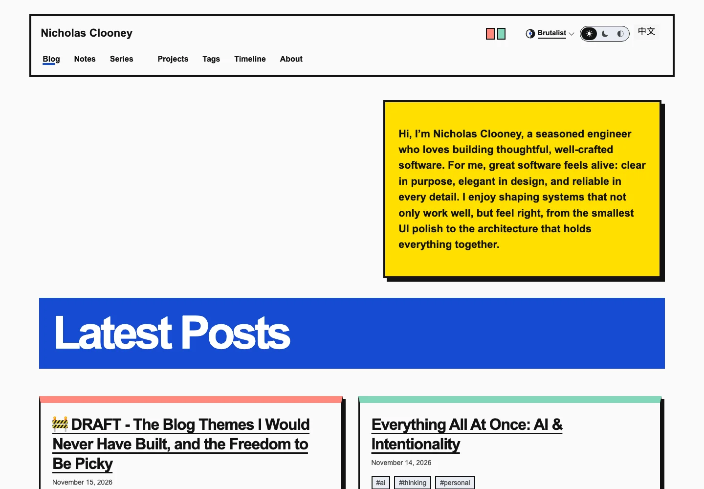
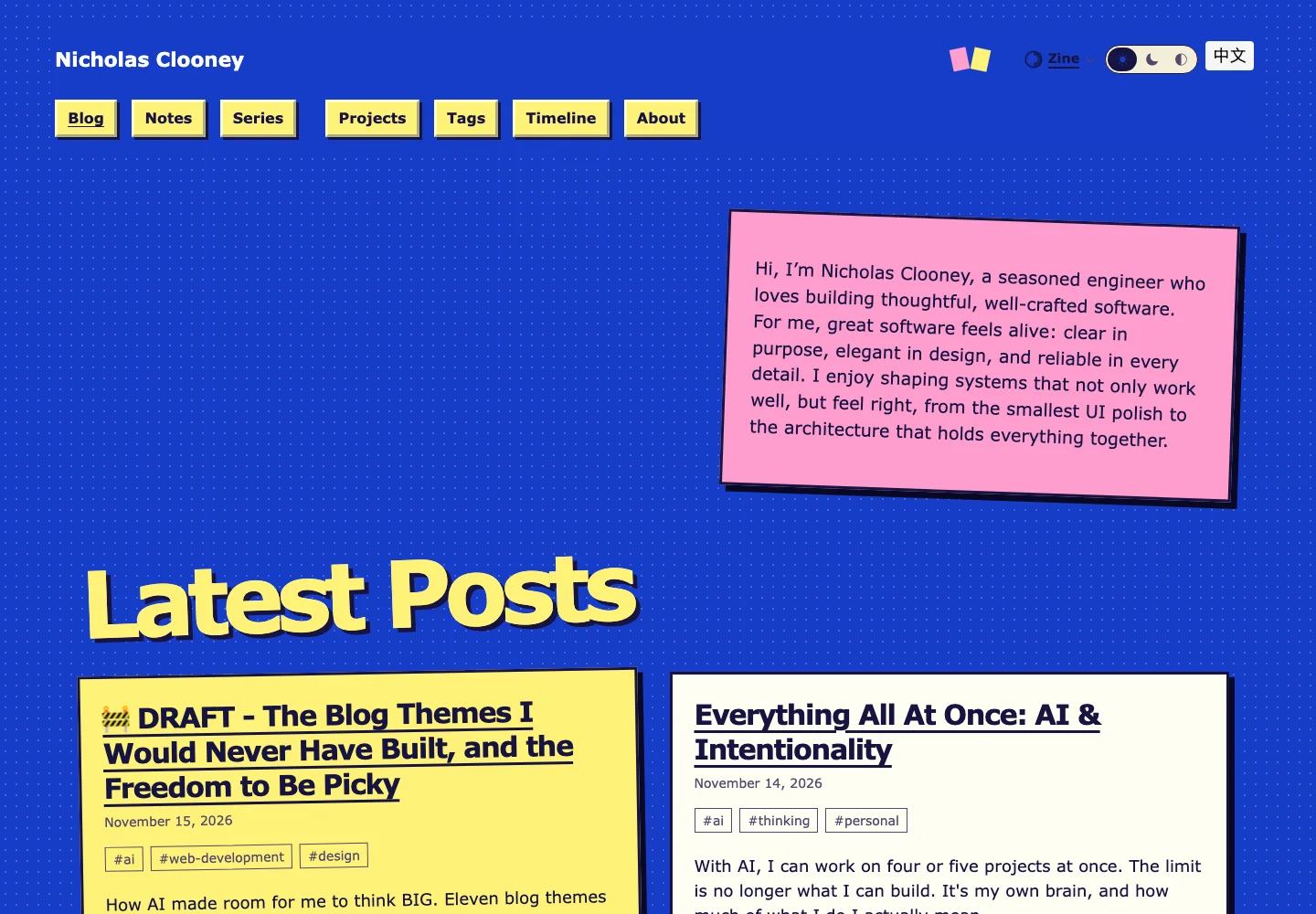
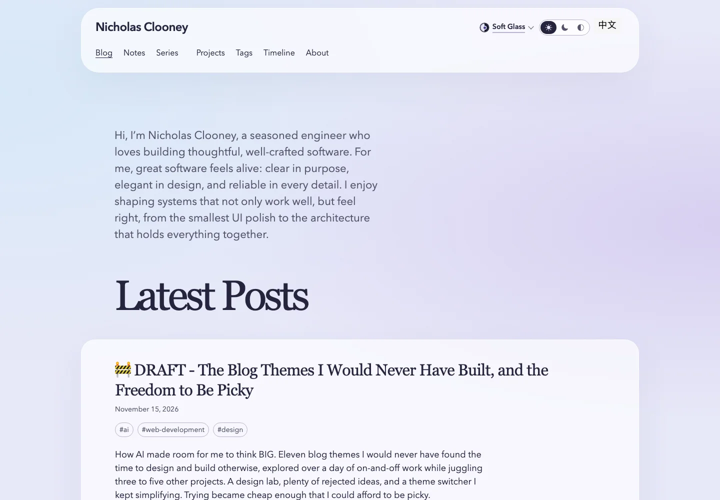
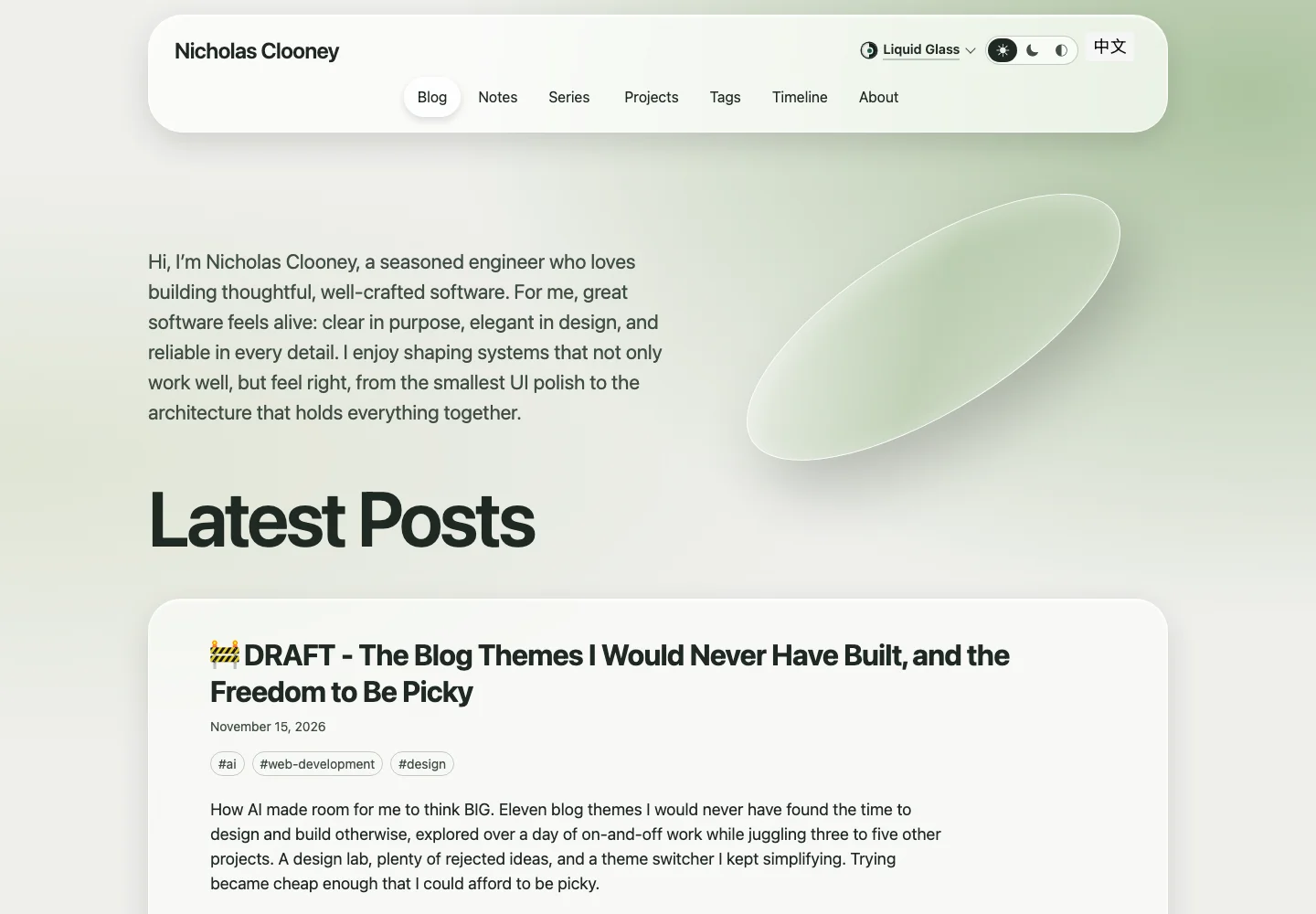
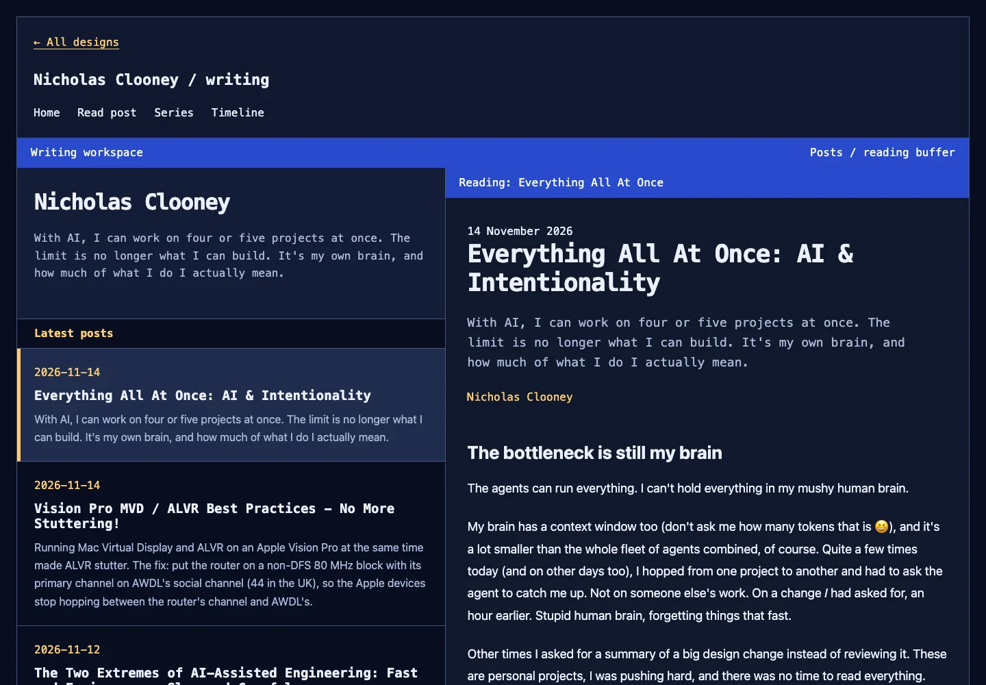
The options are easier to show than describe. These are screenshots of the same homepage at the same size, grouped by the directions they explore. Tap any image for the full-size view.
Paper, grids and hard edges
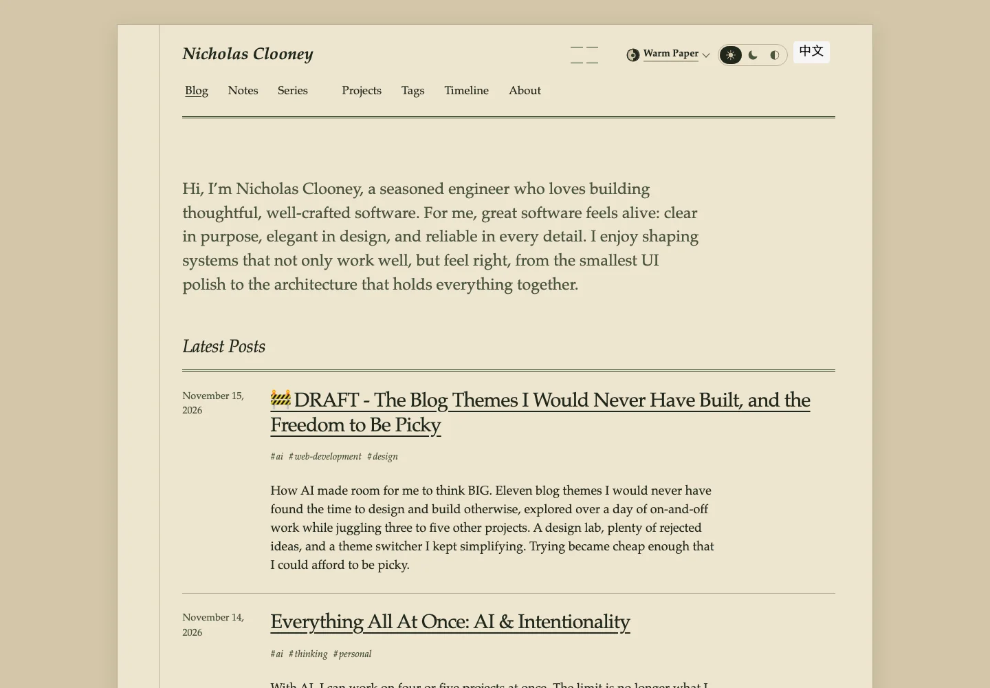
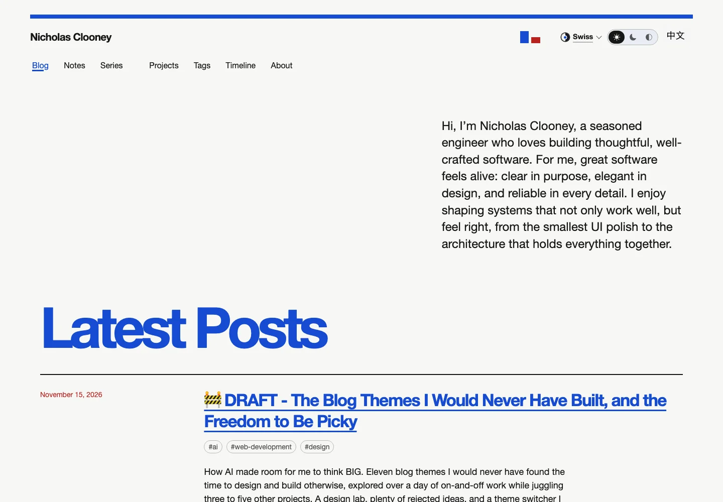
Warm Paper is quiet and bookish. Swiss was the one I liked for its balance of colour and contrast. Brutalist turns the colour up and gives everything a hard edge. Zine is much more playful.
Glass and light
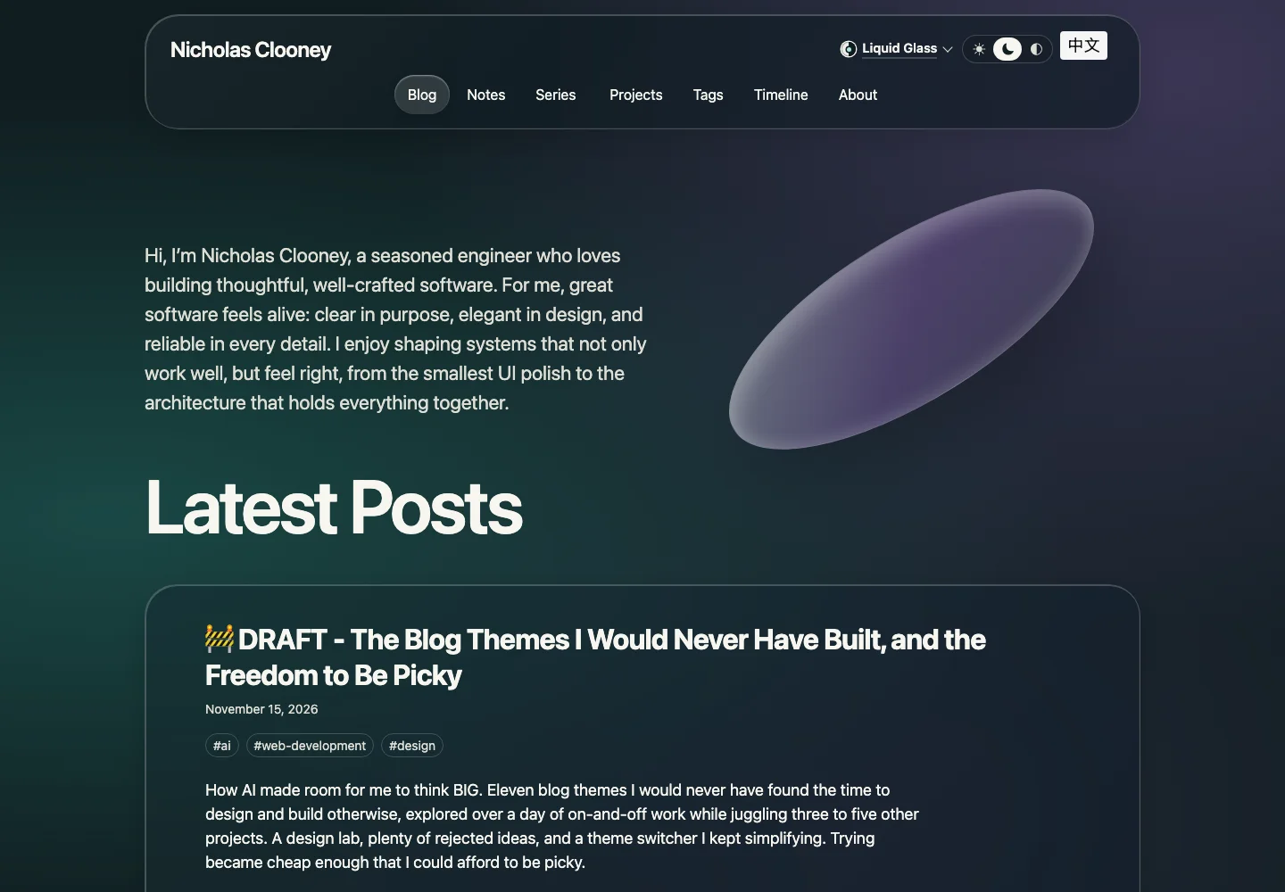
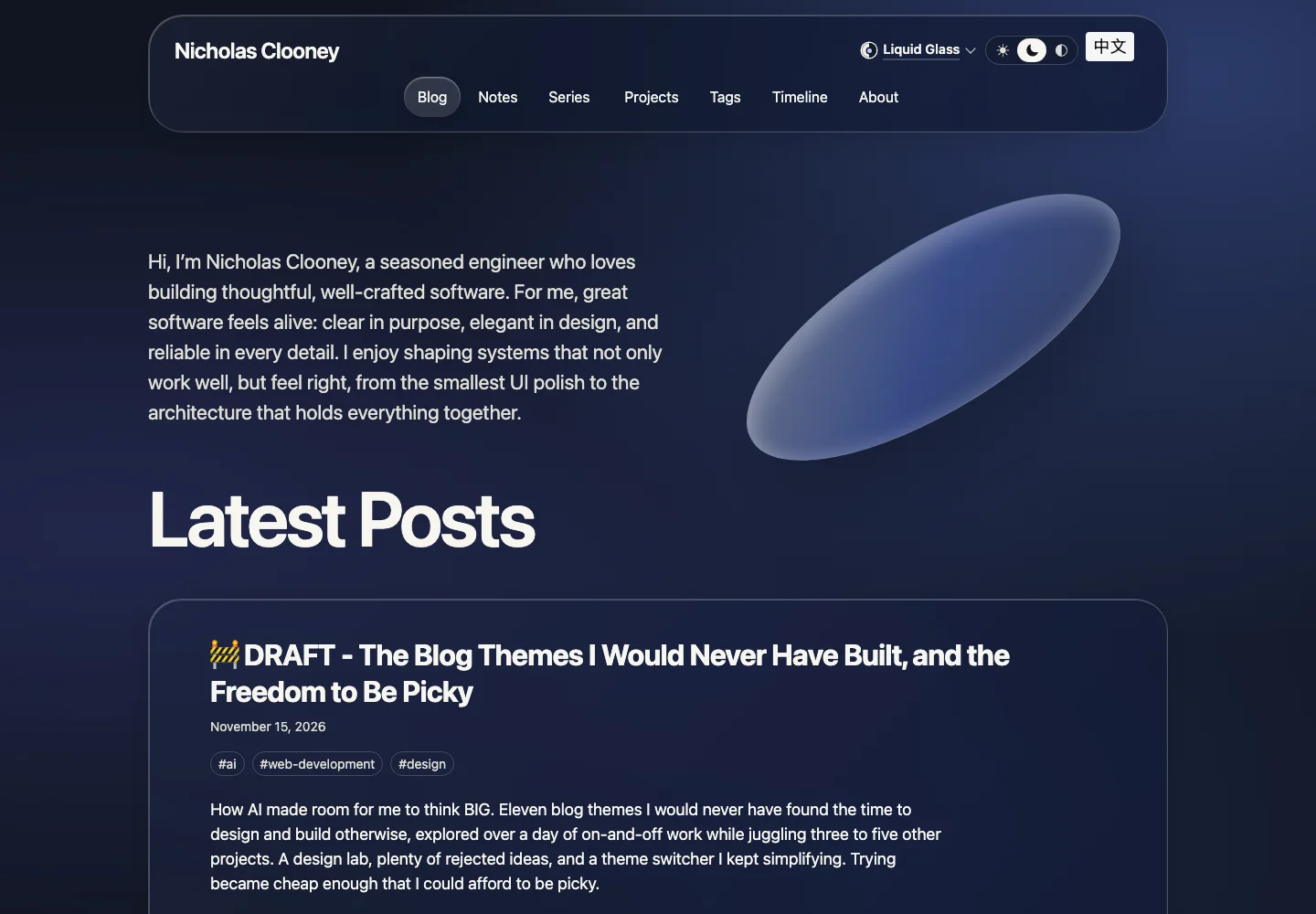
Soft Glass is softer and more rounded. Liquid Glass puts more emphasis on translucent layers and highlights. Its dark version has two palettes, Aurora and Indigo.
Three kinds of sci-fi
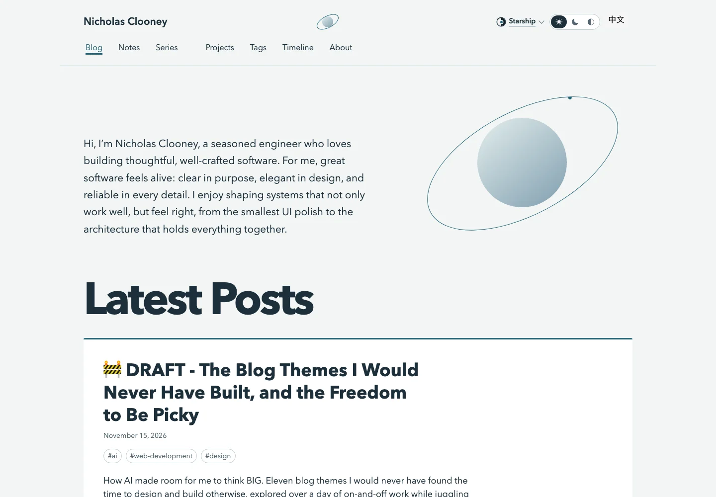
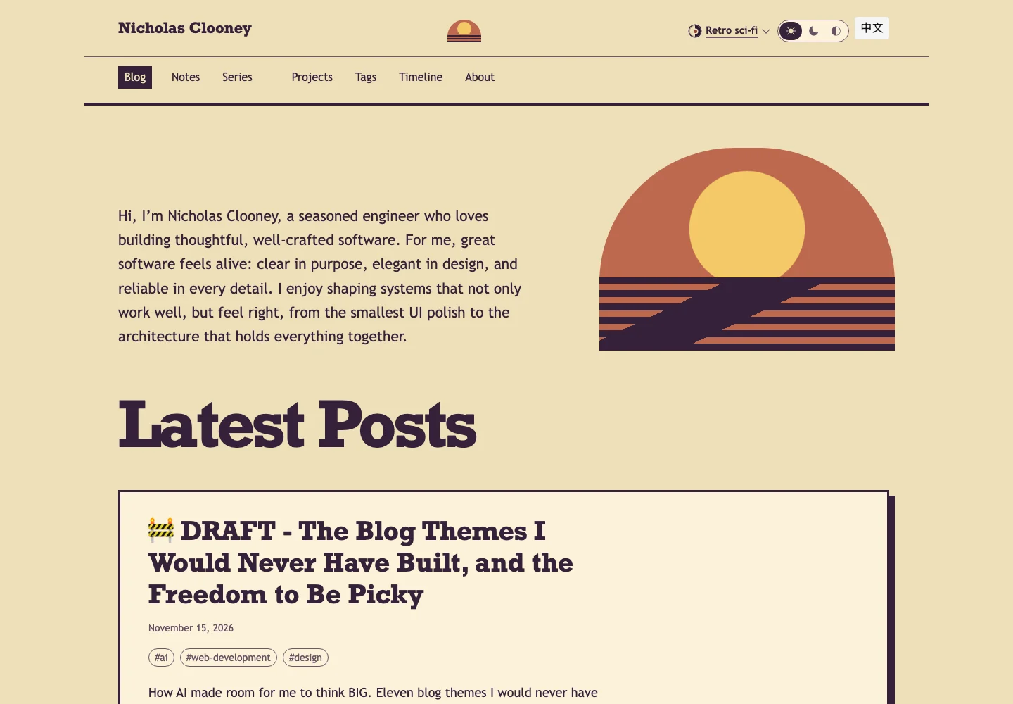
Starship is calm and spacious. Retro sci-fi is warmer, with heavier shapes and stripes. Halo goes dark and neon.
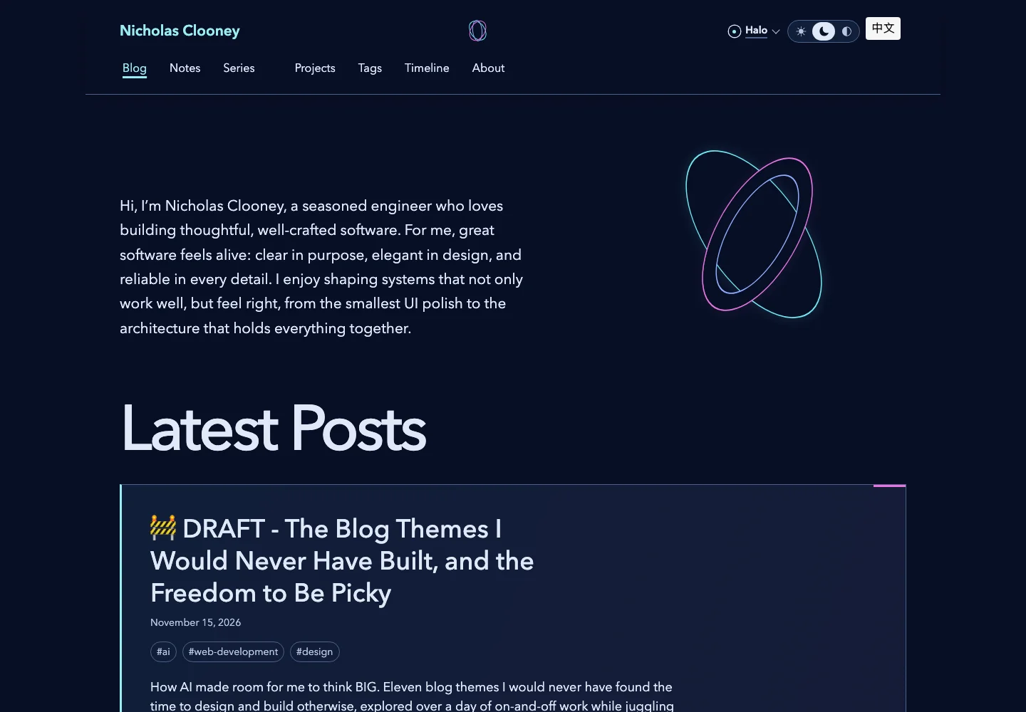
Those are eleven visual options, including the two dark Liquid Glass palettes. They aren't eleven separate websites. They are different ways of reading the same one, whether that's a long article, the timeline or a Chinese translation.
Design Lab: A place to try things before committing
We started with eight directions, then added more. There were thirteen initial mockups by the time Liquid Glass and the extra sci-fi options joined in.
I didn't want to choose from descriptions. “Warm paper” sounds nice, but what does it look like with my actual writing in it? What happens on my phone? Does the thing I like on the homepage still work halfway through a long post?
So we made a private design lab: a gallery of throwaway mockups using real public content from the blog. I could open it on my phone, compare versions and give feedback. The agents could work on different directions in parallel while I was doing something else.
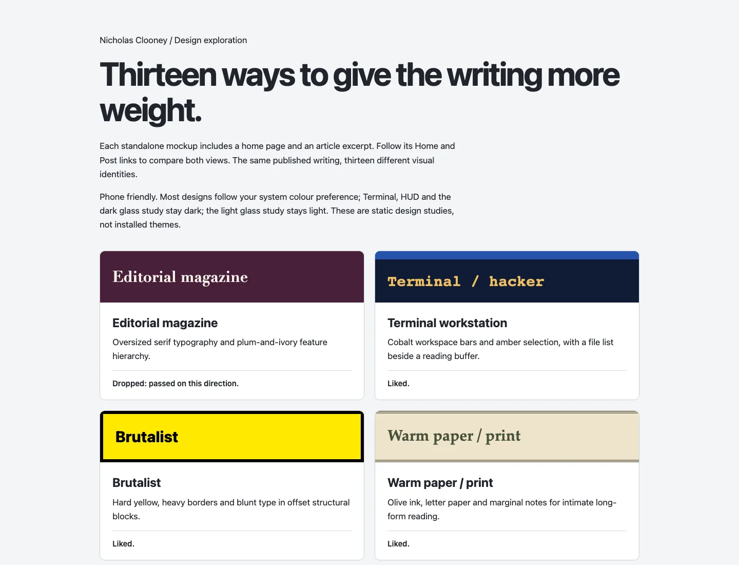
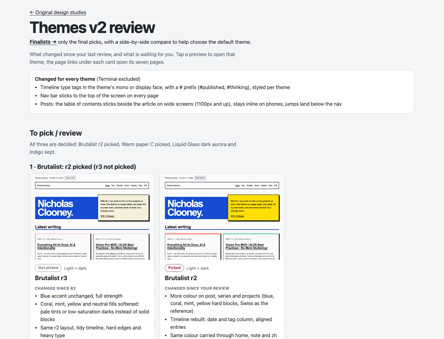
When I came back, there was something to look at. I could say “more colour”, “more contrast”, or “I like this one, leave it alone”. Revisions sat next to the earlier versions, so I could compare them instead of trying to remember what had changed.
The process became a design-lab skill. It keeps the experiments private, preserves reviewed versions and records decisions. Now I can use the same workflow to explore designs for other projects.
Keep exploring until the direction feels right
One of the early directions was an orange HUD. It wasn't doing much for me.
But I still wanted sci-fi. I asked for more options: something like a clean starship interface, something retro-futurist, and something holographic. Those became three quite different directions, and all three made it through.
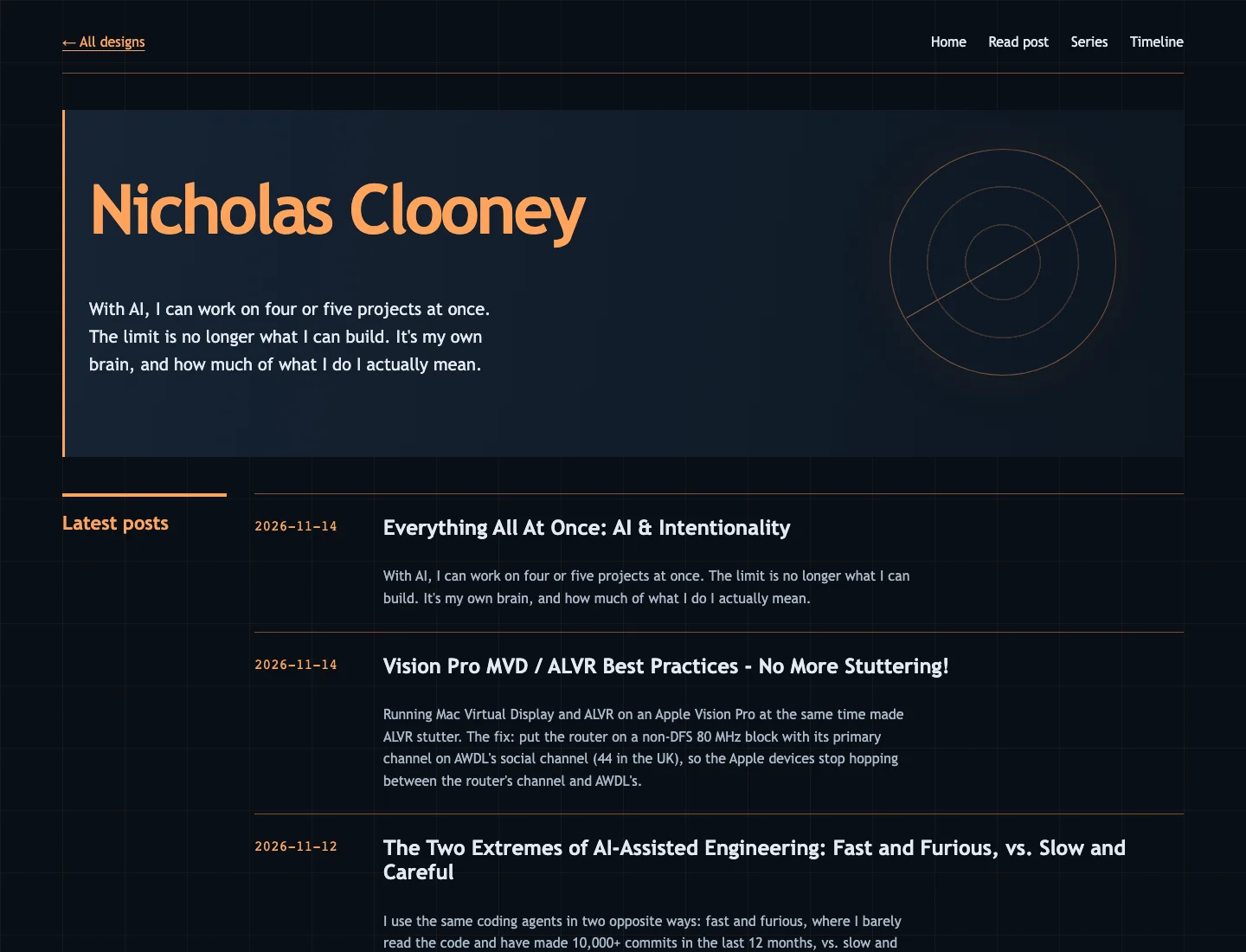
This is part of what impressed me about the AI work. It could produce alternatives different enough to help me work out what I wanted. I wasn't just asking it to change orange to blue.
And I could afford to ask. Making another direction wasn't a commitment to several more days of work. It was something we could try and judge by looking at it.
Other ideas went the other way. I liked Terminal initially, but dropped it after the fuller round. A good first impression on a homepage wasn't enough. We expanded the favourites into posts, timelines, series, projects, notes and Chinese pages, and that gave me much more to judge.
There were smaller decisions too. Warm Paper needed more contrast. Liquid Glass needed to look more transparent. Brutalist needed more colour, followed by a conversation about how much was too much. I could be specific because there was something concrete in front of me.
Iteration still needs human judgement
The theme switcher became its own design exercise. I went back and forth with Claude over the button, the panel, the previews, how light and dark should behave, and what should happen on a phone.
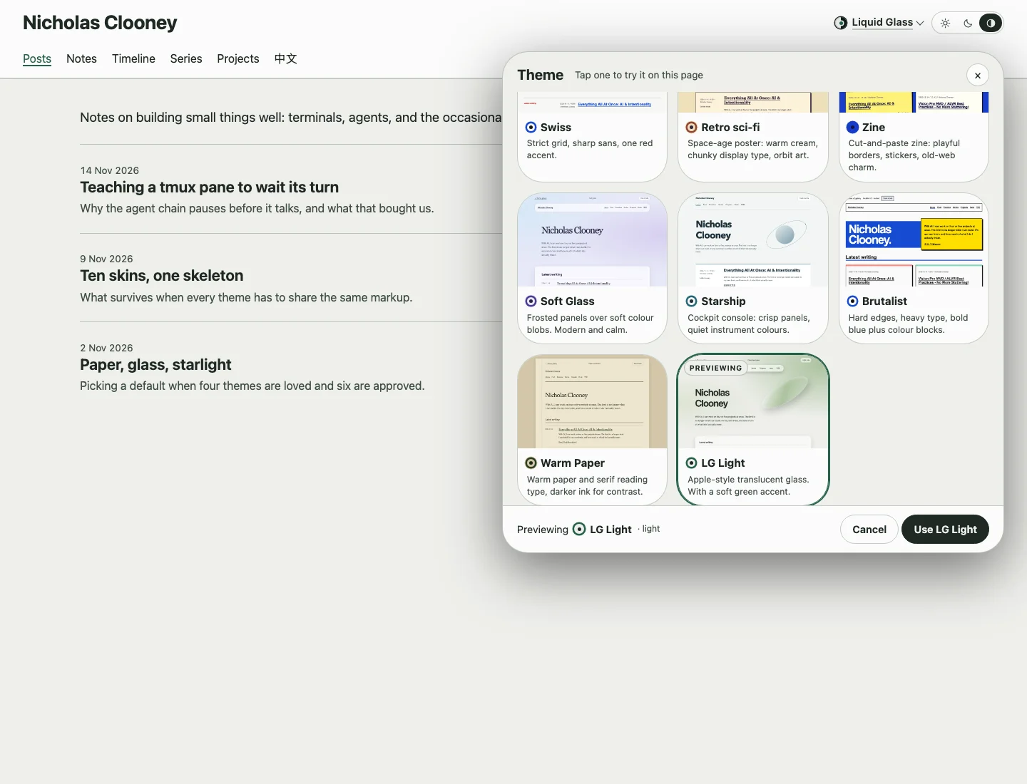
The previews show the themes on the real homepage. When I change between light and dark, the options change with the page. Even that has details: Halo is dark-only, so switching to light takes it to Starship, and switching back returns to Halo.
Then there was the basic act of choosing.
Originally, I could preview a theme and press Use to apply it. After trying it, I noticed that applying it didn't need to replay the visual effect. I was already looking at the theme.
Then I realised I didn't really need Preview and Use at all.
Clicking a theme could just select it. Give me a quick way to go back to whatever I had when I opened the selector, and let me keep trying things.
That's where we ended up: click to choose, with a revert option tied to the opening choice. Closing the panel keeps what I selected.
I like this part of the story because I didn't know the final interaction at the start. I needed to use it. The agents made it practical to follow that thought through, including the less visible details, like keeping the scroll position steady when the list changes on a phone.
We also added links that open a particular theme. I can send someone the version I want them to see, instead of explaining where to find it in the selector.
Using the site helped me judge what needed fixing, refining or removing. The agents made those changes quickly, but you still need humans in the loop to get things right.
Good foundations keep paying off
I'm glad past Nicholas put a lot of thought into how Subspace Builder was designed. The shared layouts and reusable components gave us a foundation to build on. This time, we got to reap the benefits: eleven visual options without maintaining eleven separate websites.
The mockups were deliberately disposable. The implementation builds on that shared structure with CSS skins and theme tokens, so each theme doesn't need its own copy of every page.
That is important if I'm going to keep maintaining this. Adding something to an article shouldn't mean adding it eleven times.
We checked more than the attractive first screen: code blocks, tables, images and captions, quotes, heading levels, the table of contents, Chinese text, and the different timeline entry types. The navigation stays visible, and on a wide screen the article's contents can stay beside it. On a phone, that has to fit back into the reading flow.
The freedom to be picky
In Everything All At Once, I wrote about how strange it feels to work on several projects at once, and how my own attention becomes the limit.
This was one of the good uses of that capacity. I could come back to a set of designs, look at them, make a decision and ask for another round. I still spent a day on and off. I still had to care about the details.
But without AI, I doubt I would have given myself permission to start something this broad. Eleven options would have sounded like far too much work for my personal blog.
AI made trying cheap enough that I could finally take the possibilities seriously. I was iterating on eleven themes while working on three to five other projects, all in the same day. That's the feeling I was trying to describe in Everything All At Once: there are suddenly so many things I can actually pursue, at the same time. The possibilities ahead feel almost endless.